|
IntuScope
Waveform Analyzer |
IntuScope
is more than just a SPICE post processor. It serves as a powerful waveform
display and signal processing system. IntuScope provides flexible features
that organize its signal displays, instantly provide numerical signal calculations,
and furnish 150 waveform processing functions and mathematical operations.
Data Analysis Features
- Displays
all circuit voltages, currents and power dissipations
- Accepts
data from
1) The IsSpice4 Simulator (works with actual datapoints calculated by
the simulator)
2) Linerized data saved in the IsSpice .OUT file
3) .CSDF (Common Simulation Data Format) from Pspice or Hspice
4) .TXT/.CSV (user generated data file of vector data)
5) Touchstone file (RF ICAP/4 packages and "Professional"
version)
- Displays
waveforms from cross probing anywhere on schematic after simulation
runs
- Overwrites
data, appends data or creates new signal graph using specified mode
for updating perviously viewed signals
- Can
save any displayed waveform for use as circuit stimulus
- No
size limit of waveforms to be displayed and analyzed
- Various
scaling formats include linear, semi-log, histogram, and probability
- Multiple
graphs with multiple independent scales
- Calculations
displayed directly on signals between cursors such as RMS, pk-pk, mean,
max and min
- Add,
subtract, multiply and divide waveforms
- Instantly
select (or modify script code) arithmetic, algebraic, trigonometric,
calculus
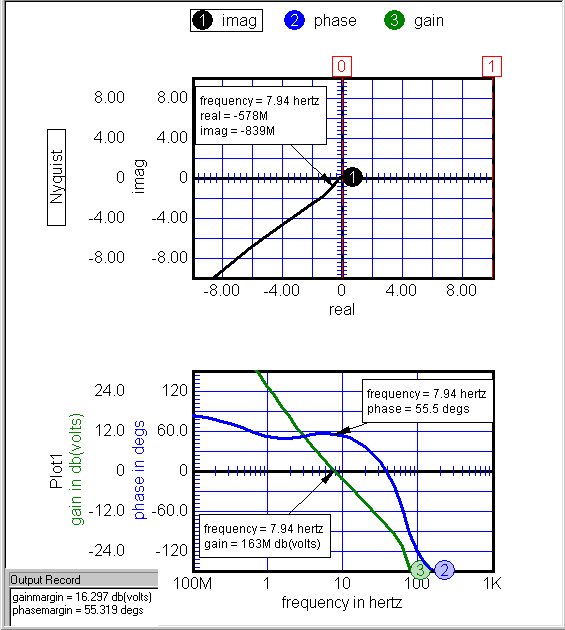
- Advanced
Waveform Functions: forward/reverse FFT, wavelet, polynomial
regression,
filtering, gain/phase margin, prop delay, rise/fall time, EMI standard,
Hanning taper, many others
- Report
quality output that you can copy and paste into other programs
- Save
all actions you create in your current graph as a script
top |
 |
|
|
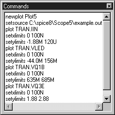
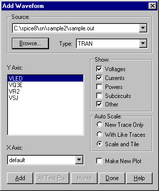
The
Add Waveform Dialog is used to select the data source. The source
may signals listed from a simulation run, or from a prior run’s
data in the simulation output file. Check boxes are provided to
globally show or hide specific waveform types within the waveform
list. An "All Test Pts" button plots all the test point
waveforms simultaneously. Autoscale enables waveforms to be automatically
scaled, tiled and/or linked as they’re added to a graph. |
| top |
|
| |
 |
|
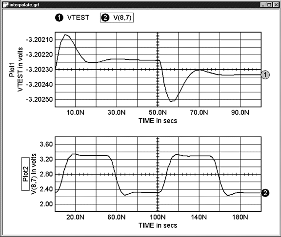
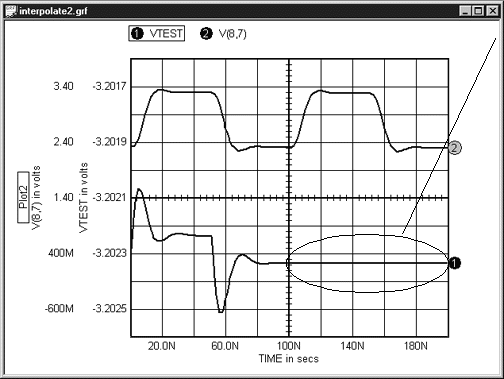
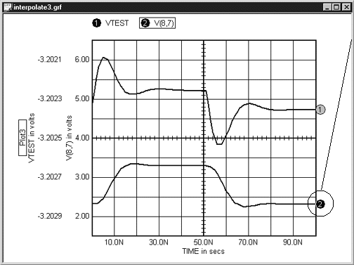
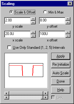
The
Scaling Dialog includes scale/offset or min/max settings to expand
or contract the desired viewing area for signals. One an also limit
the X- and Y-axis scaling to multiples of 1, 2 and 5, just as you
would see on a laboratory oscilloscope. Further, multiple waveforms
can be added to the picture window to manipulate them all at once.
The two horizontal scroll bars at the bottom of the dialog are linked
to easily pan waveforms to a desired resolution. The lower bar changes
the scale. If the scale has been reduced so only a portion of the
trace is displayed, the upper scroll bar then pans the displayed
portion. |
| top |
|
 |
|
|
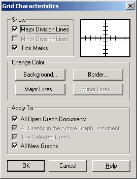
A
“Grid Characteristics” dialog allows the user to control
IntuScope's grid line characteristics (equivalent to major/minor
division lines or tick marks). It also changes the color of the
background, border and division lines. |
| top |
|
| |
 |
|
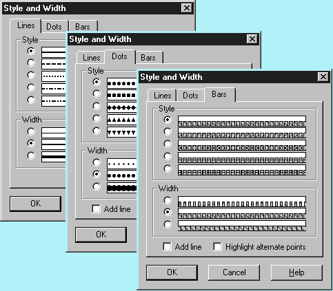
Select
among several line, dot, and bar styles to create presentation quality
graphs.
Several options are shown to the right. An example signal graph
with different waveform styles and widths is shown below. |
| top |
|
 |
 |
|
|
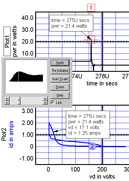
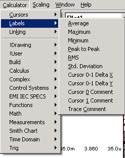
Another
valuable feature with IntuScope includes waveform labels shown in
the Calculator menu on the left. Labels for the most common measurements
can be placed directly on any waveform graph with a single mouse
click. They can be individually moved, resized, and customized to
change text font, color and justification. The background color
and border display can also be customized. |
| top |
|
| |
 |
|
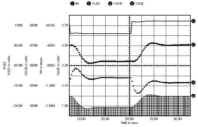
Y-axis
scales can be prescribed to show up to 20 signals. The current selected
waveform will have its Y-axis scale moved closest to the graph.
The waveforms to the right were instantly autoscaled and tiled as
they were added to the graph. All four traces have the same x-axis
scaling, and each shows its y-axis scaling label. Traces can be
moved vertically or horizontally by clicking and dragging the mouse
in the desired direction. Traces can also be copied and pasted from
one plot to another, or similarly dragged and dropped. |
| top |
|
 |
|
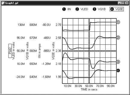
| Several
plots can now be displayed within a single window (left). You can
mix and match different plot types (i.e., Tran, AC, etc). Added waveforms
can append to an existing graph, or specify to display in a new graph.
|
| top |
|